Photo Assignment #5: Light Painting
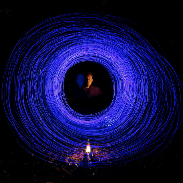
For my fifth photo assignment, I decided to (at last) do light painting. Of course, I was always planning to do light painting at some point, I just didn't feel confident enough in my technical skill to do so until now. It was actually learning how to take photos using the timer during the Multiple Me Assignment that prompted me to try my hand at light painting. Using a tripod, a timer, a string of blue lights, a lantern, a phone, and the pitch black darkness of my backyard, I managed to create the images seen below. I mostly focussed on trying to perfect a single effect because I would rather have one good photo than a bunch of mediocre ones.
Best Photo
 |
| Edited Photo Adjusted Color Balance, Crop, Brightness, and Contrast |
 |
| Original Photo Aperture: f/8.0 Shutter Speed: 15 ISO: 80 |
I actually made a few major edits to this photo. Of course, there were my standard adjustments of contrast, brightness, and saturation, but I took it a step further with this photograph. The final photo is actually a combination of two of my photos. The majority of the image comes from the "Original Photo" pictured above, but the face actually comes from the third runner-up photo. Basically, I chose the best face and combined it with the best overall photograph. In addition, I adjusted the hue of the face so that it was red/orange like the light on the ground. Because it was light painting and the majority of the image was black, I was able to make these changes without them being noticeable.
5 Runner-Ups
The main thing I learned from this photo assignment was how a super slow shutter speed affects the light in an image. Of course, I understood the concept of light painting before I tried it, but before this, I'd never gotten to "play" with it a see how it actually worked. By actually doing the assignment, I learned a lot about how the different lights show up on camera. Also, I learned how still you need to be when your face is illuminated, less the image gets blurry. I only wish I had more lights so I could've captured more of the background.


This is really awesome! Your image evokes a really powerful feeling, and the light painting is really well done. It's surprising that you don't have more comments on your posts but maybe it's just something about being at the top of the list alphabetically. I think the fire and leaves (I assume?) at your feet are a nice touch, and the color of the yellow light contrasts the blue nicely. The nature of the shapes draws the viewer's eye to the center of the image. If I had any suggestions it would be to maybe leave more space on the crop so that it doesn't seem as cramped, (though i would keep the square frame), and I know it's difficult to control but I would have liked a bit more stray lines around the edges of the circle, to accentuate the tapering effect. Overall, really well done, your photos are hard to critique!
ReplyDelete