Photo Assignment #4: Food
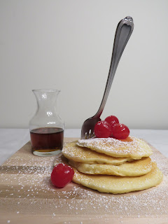
For the fourth photo assignment, I chose to do food photography. I didn't really make this choice ahead of time, it just happened to be the one that I was capable of doing last weekend. I took some of the pancakes my dad had made for breakfast and set up a Pinterest-esque photoshoot on a desk. I also made sure to adjust the white balance for the indoor lighting that I was using. I think everything turned out great, I only wish I'd had more pancakes in the stack. Unfortunately, I'd eaten all the others for breakfast.
Best Photo
 |
Edited Photo Adjusted Contrast, Brightness, and Saturation |
 |
| Original Photo Aperture: f/5.6 Shutter Speed: 1/40 ISO: 200 |
I made slight edits to this photo to make it look better. In my original photograph, the background was far too gray, so I brightened the image to make it whiter. In addition, I boosted the contrast and saturation to make the food look fresher and tastier. Finally, I did some detail work and darkened the syrup so that it was more noticeable.
5 Runner-Ups
The main thing I got out of this photo assignment was refining some of the skills I'd worked on in the still life photoshoot. In those pictures, I had worked on taking pictures in a very dark environment— a pure black background. In these, I did the exact opposite. I wanted to create a bright white background, as if I was taking pictures in a light box. In order to do this, I had to manipulate the lighting, the camera, and the set. I used bright spotlights to remove as many shadows as possible, I adjusted to white balance to make it actually look white, and I put a white sheet over the desk so that it matched the wall. By combining these techniques, I was able to create food photography that looked both delicious and professional.


These are gorgeous! I think you really understood the aim of food photography. The framing and composition works really well, and the lighting is clean and well placed. Pictures of food often look a little sloppy or 'off', but this is really well done. I love the bright color of the cherries, it really draws the eyes. If I were you, I would try to fill the entire bottom of the photo with the cutting board, so it looked like a larger surface and you couldn't see the corners. Nice job!
ReplyDelete