Photo Assignment #1: Animals
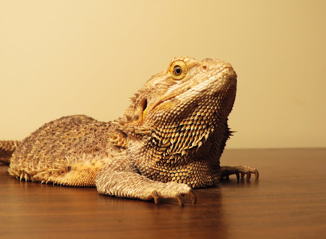
For this first assignment, I chose to shoot pictures of animals. Well, more like an animal. I was intending to take shots of both my lizard and my cat, but my cat was too difficult to work with. To further complicate things, all my pictures had to be taken inside because the lizard isn't allowed outside. This is why all of the photos have such a boring background. However, I think the clean, uncluttered frame actually helps to highlight the lizard and her spikes.
Best Photo
 |
| Aperture: f/4.5 Shutter Speed: 1/50 ISO: 200 |
I made some minor edits in order to improve the quality of this first photo. I made adjustments to the brightness, contrast, and levels so that the photo looked "crisper." In addition, I slightly adjusted the color balance to make it less yellow (admittedly, it still looks rather monotone). Finally, I flipped the canvass horizontally because I thought it improved the composition.
5 Runner-Ups
The main thing I learned from this assignment was how to take quality photos while inside the house. In the past, I took most photos outside because inside it was always too dark and the frame always seemed cluttered. However, for this photo shoot, I put a little effort into it, and it turned out great! With the use of a spotlight and a clean desk as my scene, I was able to take photos inside that look neither cluttered or dark (though they admittedly still look a little boring).


The composition of the photo is great. I feel that the photo really captures the behavior of the reptile. If there was one thing I would have to point out, it would be that the back of the reptile gets somewhat blurry. Other than that, the contrast is great and it is overall a well composed photo. Well done!
ReplyDeleteI really like this picture. It's very satisfying to look at, so that makes me happy. One thing I would do if I took the picture is go a little bit to the left so the eye is on the third line. Humans naturally try to look for eyes and faces, so putting it on the third line may make the picture a little bit more interesting and attention grabbing. The last bit of advice I have is to up your contrast and saturation, but that's a thing for every photo. Nice picture!
ReplyDeleteI think the composition of this photo works really well, the tan color scheme gives off the vibe of a dry desert, which fits in nicely with the subject. You can really see the texture of the spines, and her scales capture the reader's attention. I'm glad you decided to go with a horizontal crop because anything else would feel too cramped. her eye makes for a striking focal point. The only points of improvement I noticed were a bit of blur on her claws and some dust on the table. There is a tiny lens smudge in the bottom left corner but it's not too distracting. Otherwise, the artistic and technical elements of the photo work really well together!
ReplyDeleteI really like photo you can really see all the different textures and scales it has on its body. If you look just at the end and then the body its like a completely different animal texture wise. Well done on this photo.
ReplyDelete